


Last updated on December 29th, 2023
Have you ever pondered the impact of your ceiling color choice on your room’s vibe? Traditional white may seem like a safe bet, but there are colors that experts advise against when painting ceilings. With a plethora of shades that can alter the mood and appearance of your room, it’s important to choose wisely.

In this guide, we explore six colors to steer clear of when embarking on your ceiling paint journey, while encouraging you to let your personal style shine through. Remember, the ceiling is as much a canvas as your walls, and the right color can completely transform a room’s ambiance.
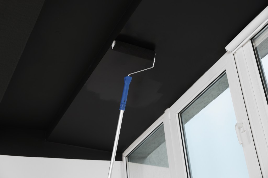
Dark Hues: Creating Coziness or Claustrophobia?
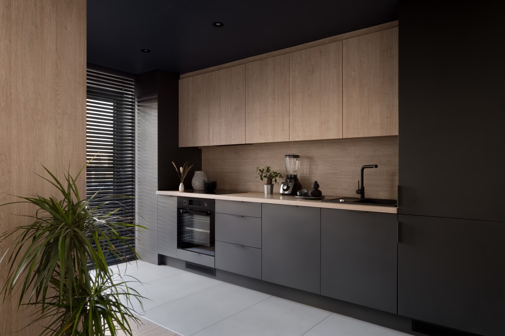
Dark ceilings, while great for creating a snug, enveloping feel, can be tricky. They can make rooms feel cramped and ceilings appear lower, especially in smaller spaces. If you’re considering a dark hue, think about the room’s size and height to ensure it doesn’t overpower your space. Be cautious with colors like deep blue or charcoal, which can absorb light and shrink the perceived space. For further insights on ceiling designs, explore Design Dossier: All You Need To Know About False Ceilings. This guide delves into the nuances of false ceilings, providing you with creative ideas to transform your space.
Pastels: The Unwelcome Sterility
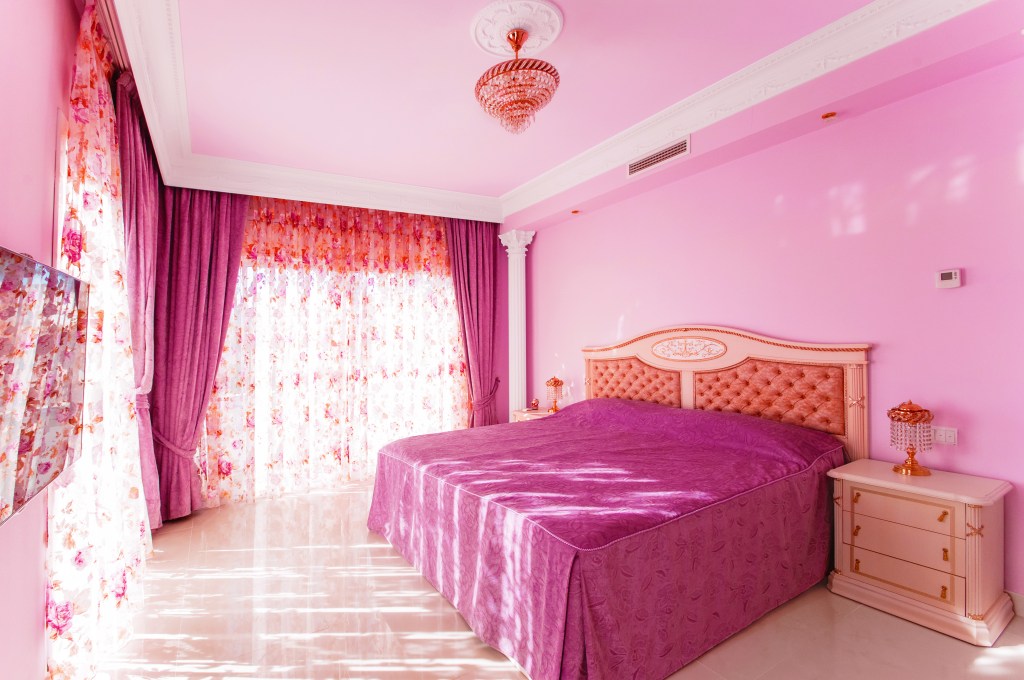

Pastels, often associated with sterile environments, might not always be the best choice for a ceiling. These shades can inadvertently bring an institutional feel to your cozy space. Opting for richer or earthier tones can add warmth and character, avoiding the clinical look. Pastel hues, especially in shades of pale pink or baby blue, can lack the depth needed for an impactful ceiling.
Bright White: A Lackluster Choice
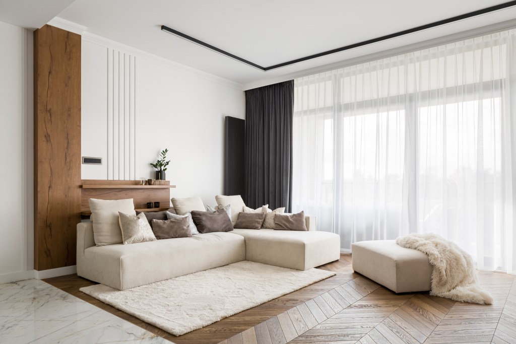
The most common ceiling color, bright white, can sometimes result in a lackluster appearance. Subtler neutrals or soft whites can add warmth and depth, creating a more inviting space than stark white shades. Consider off-white or creamy shades to add a touch of elegance without overwhelming the room. If you’re rethinking a white ceiling, our article 7 Reasons To Ditch Your Boring White Ceiling provides compelling alternatives. Discover how different hues can elevate your ceiling from mundane to magnificent.
Neon: A Bold Misstep
While neon colors are vibrant and lively, they can be overwhelming on ceilings. If you’re drawn to bold shades, consider using muted versions of these hues to avoid creating an overpowering and restless atmosphere in your space. Neon shades should be used sparingly and thoughtfully to avoid visual chaos. For those seeking to make a bold statement, 4 Statement Ceilings To Make Heads Turn! offers some awe-inspiring ceiling design ideas. These examples will inspire you to think outside the box and create a ceiling that truly stands out.
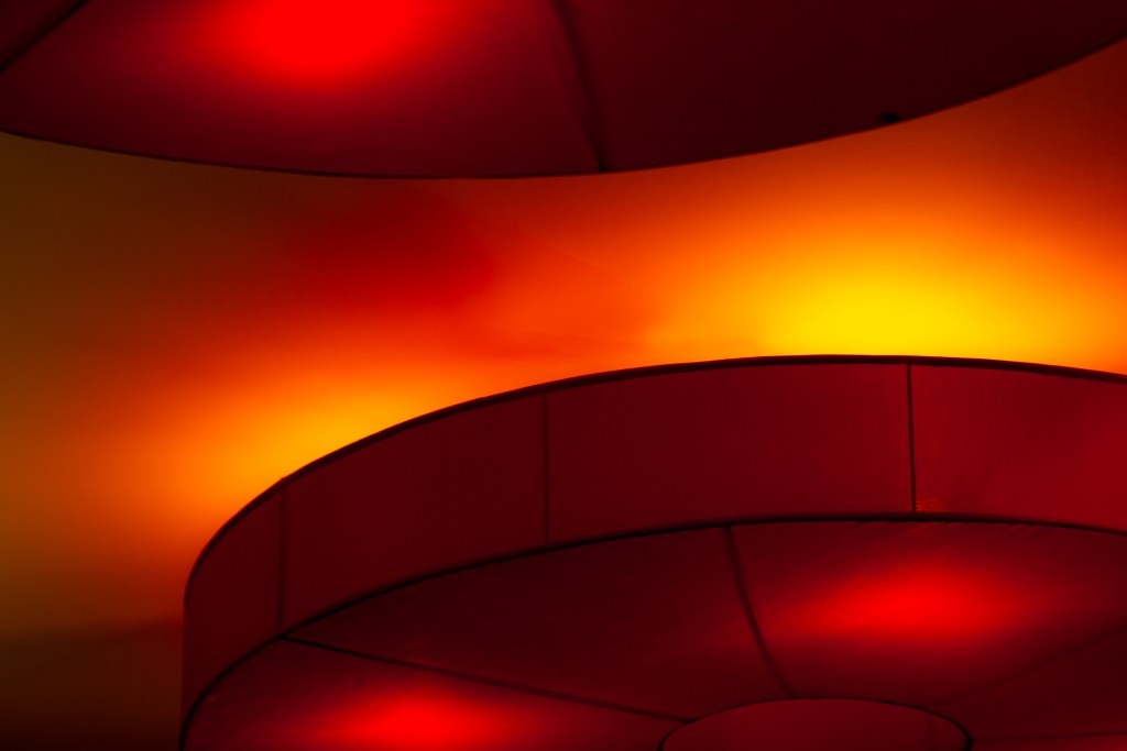
Green and Red: Unflattering Undertones

Green can cast unflattering tones in certain lights, while red, a color of power, can also evoke anxiety. These primary colors, due to their high saturation, can be harsh and intense, especially in smaller or more intimate spaces. Be mindful of the specific shades of green and red, as some variations can be more forgiving than others.
Should Ceilings Match Walls?


Painting ceilings the same color as walls can create a unified, modern look, especially in specific areas like offices or playrooms. However, differentiating the colors can draw the eye upward and enhance the room’s overall aesthetic. A contrasting ceiling can add an element of surprise and elevate the room’s design.
Our Take:


The right ceiling color can profoundly influence your room’s overall feel. While there are shades experts generally advise against, the ultimate choice should align with your personal style and desired ambiance. For more insightful decor tips and inspiration, visit the Homebliss blog, your trusted resource for all things home interior! Embrace the opportunity to experiment with color and create a space that truly reflects your personality and style.