Last updated on June 17th, 2024
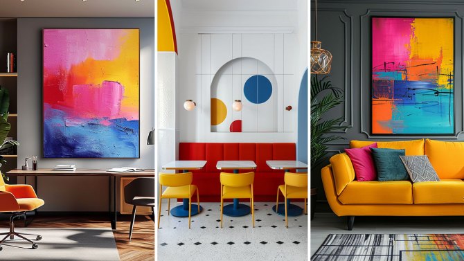
Have you ever wondered why some rooms just seem to radiate harmony and elegance while others fail to hit the mark? Much of that difference comes down to color choice. Color has the transformative power to not only fill a space but also to enhance mood and evoke emotions.

However, mastering the art of color pairing is no small feat—it requires a keen eye for detail and a deep understanding of how colors interact. Below, we’ll dive into some of the most common color-pairing pitfalls and provide expert tips on how to sidestep these mistakes to achieve a beautifully balanced room.
Interiors in need of an upgrade?
1. Ignoring the Impact of Lighting

Lighting plays a crucial role in how colors are perceived in any space. A common mistake is failing to consider how natural and artificial light will interact with paint colors, which can lead to colors looking drastically different than expected. To remedy this, always test paint samples under the lighting conditions of the room at different times of the day. This will help you see how the color changes and ensure it meets your vision in all lighting scenarios. Additionally, experimenting with different types of light bulbs can influence how paint colors appear, from soft whites to bright LEDs, each can alter the appearance and mood set by your color choices.
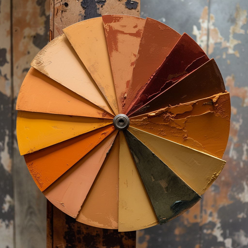
2. Neglecting Color Undertones

The subtleties of color undertones can make or break a color scheme. Overlooking these undertones is a frequent error that can cause colors to clash unexpectedly. To create a cohesive look, pair colors that share similar undertones—warm with warm or cool with cool. This approach will help maintain a balanced and harmonious atmosphere in your space. By closely examining these subtleties, you can avoid harsh contrasts and subtle discord in your color choices, leading to a more visually pleasing and emotionally comforting environment.
Interiors in need of an upgrade?
3. Overlooking Wall Preparation

Proper wall preparation is essential for achieving professional-quality results. Skimping on this step can lead to poor paint application and colors that look uneven or splotchy. Ensure walls are smooth, clean, and primed before painting. This preparation will provide a clean canvas that will let your chosen colors shine. It’s also wise to invest time in patching any imperfections and applying a high-quality primer to ensure that your color choices look vibrant and last longer.
4. Not Thinking Of Paint Finishes
Different paint finishes can affect the appearance of colors, altering their impact in a room. Matte finishes absorb light, while glossier finishes reflect it, affecting how a color is perceived. Consider the finish when coordinating colors, especially if different sheens are used in the same room. This will help ensure that all elements work together seamlessly. Understanding the effect of each finish can significantly enhance the overall aesthetic of your space, adding either a subtle elegance or a striking vibrancy to your room.
5. Choosing Shades That Are Too Similar

When aiming for a monochromatic look, avoid choosing shades that are too close together, as this can lead to a lack of definition and interest in the space. Instead, opt for a combination of light and dark shades of the same color to add depth and dimension. This strategy not only enhances the aesthetic appeal but also brings a dynamic energy to the room. By introducing varying shades, you can create a rich, layered look that adds complexity and sophistication to your monochromatic scheme.
Interiors in need of an upgrade?
6. Relying on Small Paint Swatches

Using small paint swatches to decide on a room’s color scheme is often insufficient to fully understand how the color will feel in the space. Instead, apply large swatches of paint directly to the walls to better assess how the color interacts with the room’s lighting and surroundings. This larger display can help you make more informed decisions about color compatibility and overall effect. This approach mimics how the colors will actually appear, allowing you to make adjustments before committing to the full painting process.
Conclusion: Perfecting Your Palette

Tackling your home’s color scheme can feel like navigating a minefield of do’s and don’ts, but armed with the right knowledge, you can turn potential pitfalls into a spectacularly designed space. Remember, the right color combinations can not only change the look of a room but also its mood and feel. With these tips, you’re well on your way to mastering the art of color pairing, creating spaces that are both beautiful and balanced. So, go ahead, experiment with confidence and watch as your home transforms into a visual delight.
For more home decor insights and practical decorating tips, be sure to check out our blog at Homebliss.in. Join us as we explore innovative ways to bring your home decorating ideas to life, ensuring every color choice is spot on, and turning every room into a masterpiece of design.