

Last updated on January 19th, 2026
Kids feel colour before they understand it. Wall shades quietly influence their energy, focus, sleep, and even how they interact.
The trick is not picking the “prettiest” colour, but the one that helps them feel and behave their best in that room.
Red: Zoom Mode Activated
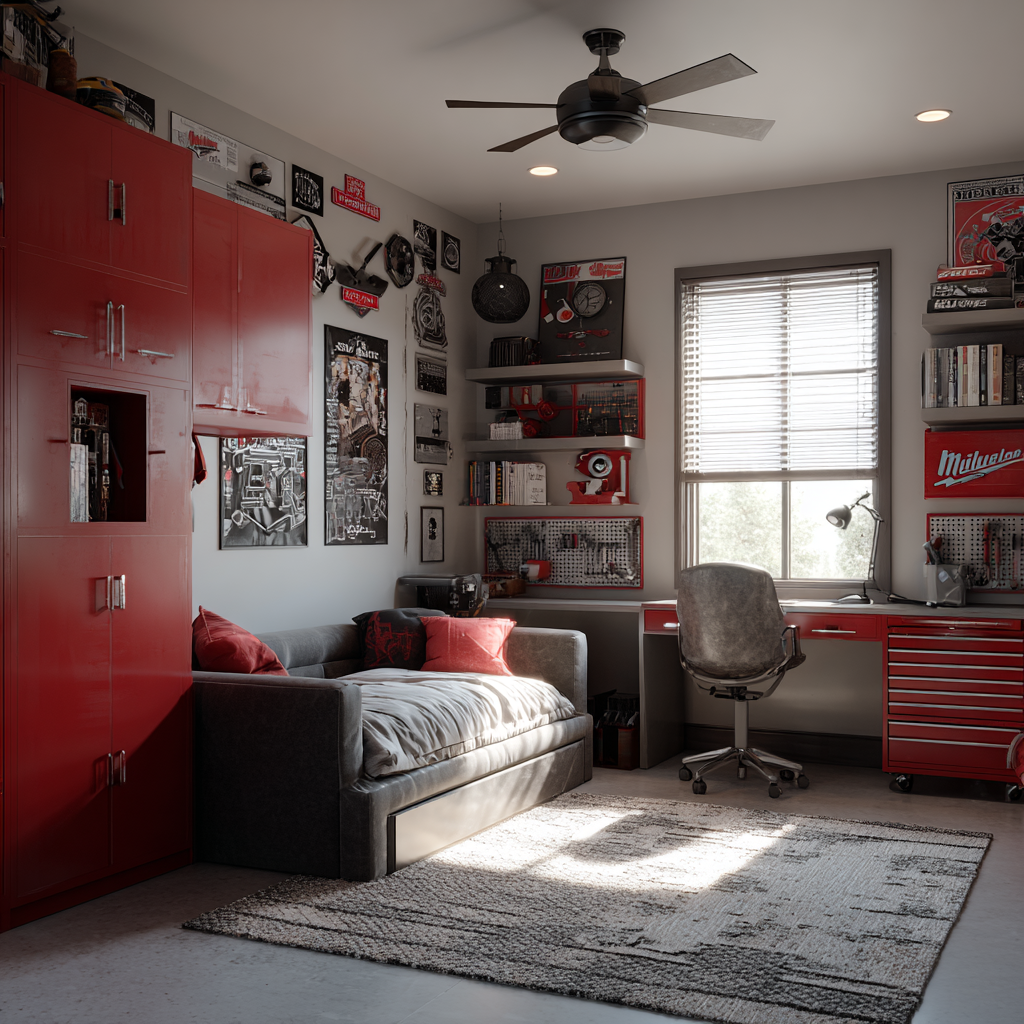
Red turns the energy dial up. It’s bold, exciting, and great for play zones where running, jumping, and Lego explosions are allowed. In bedrooms or study corners? Not so much. It can make kids feel a bit too buzzy when you want them calm. So it’s a good accent colour, not always a good full-wall choice.
Looking to get your interiors done?
Orange: Chatty, Warm, and Full of Life

Orange loves company. It boosts social energy and makes kids want to talk, share, and play together. The softer the orange, the better it feels. Bright orange is fun, but mellow orange feels warm without the overwhelm.
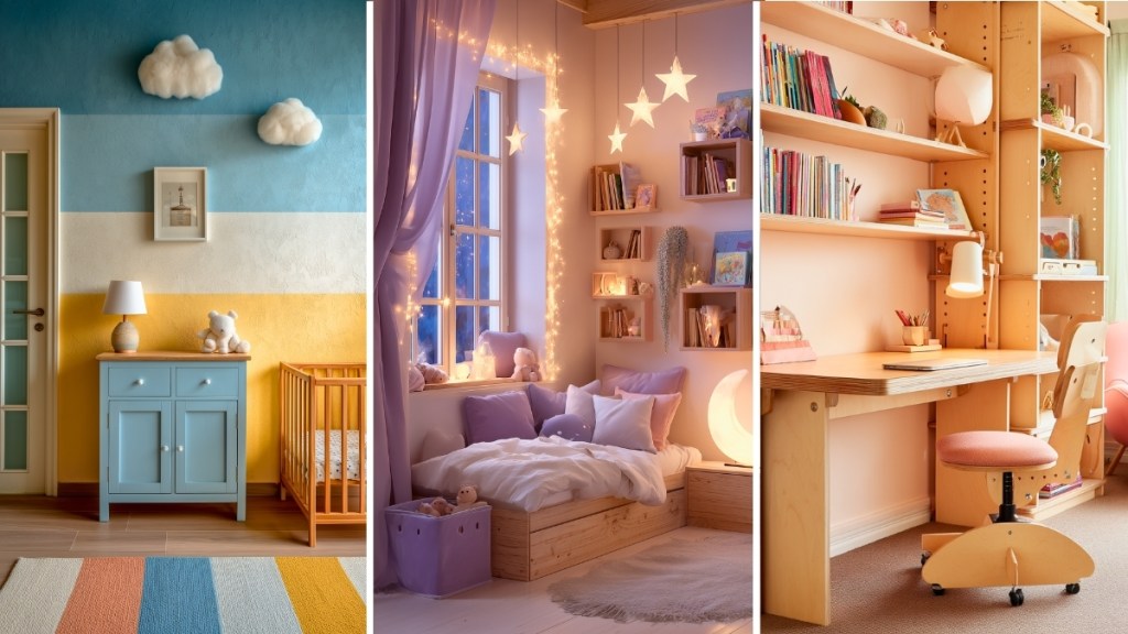
Yellow: Sunshine for the Brain
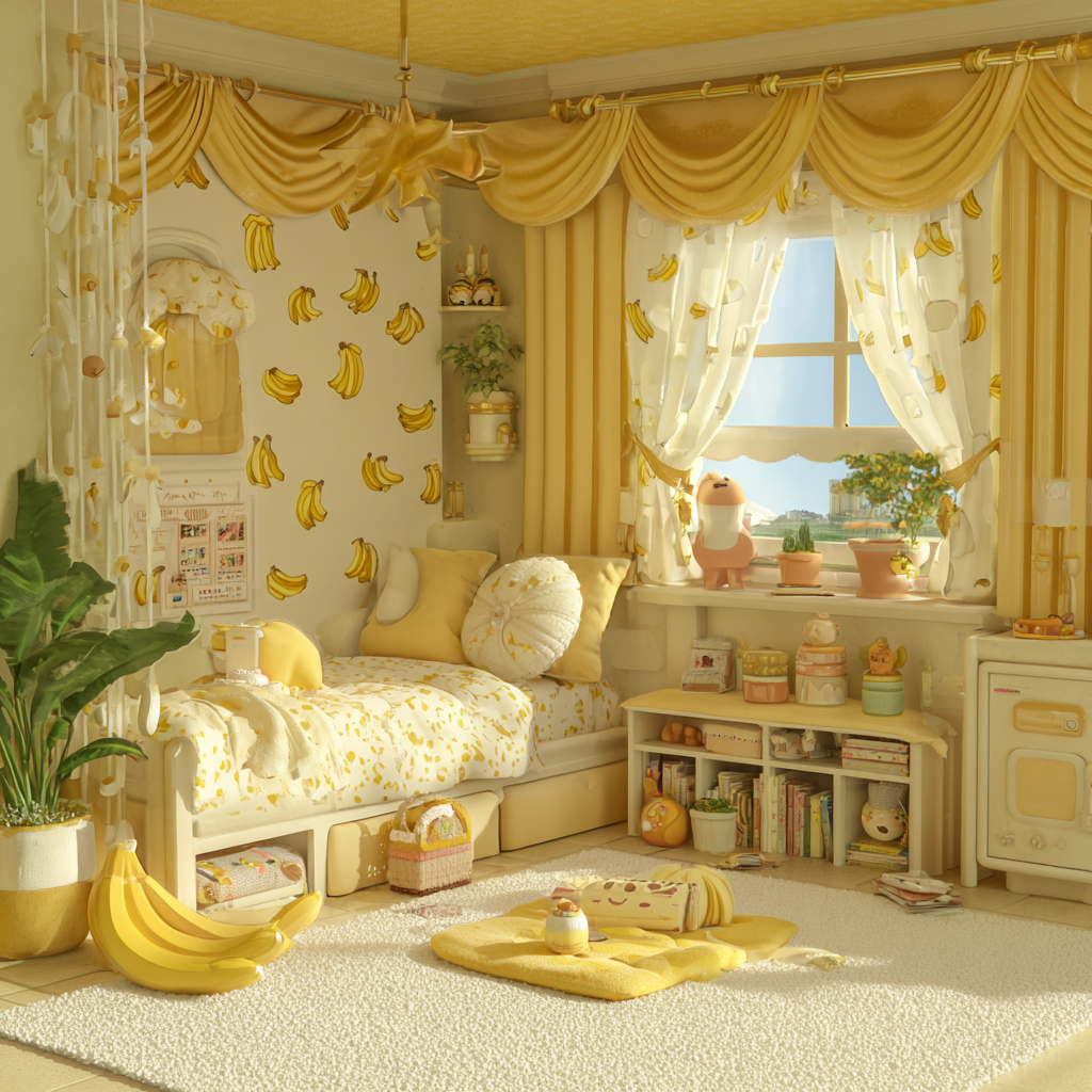
Yellow lifts mood and spreads instant cheer. It inspires curiosity and happy energy. But super bright yellow can make kids a bit scattered. Go for buttery, soft, or warm yellows that feel like morning sunlight, not stadium lighting.
Looking to get your interiors done?
Green: Nature’s Chill Pill
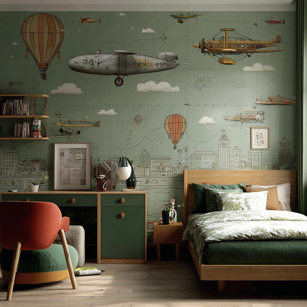
Green is a steadying colour. It calms nerves, reduces tantrum frequency (no promises, but it helps), and boosts focus. It works in bedrooms, playrooms, and study zones because it balances energy beautifully.
Blue: Cool Mind, Less Chaos

Blue brings calm, focus, and emotional balance. It helps kids settle mentally and stay on task. Just avoid shades that feel too icy or dull. Soft, mid, or sky blues feel calming without feeling cold.
Looking to get your interiors done?
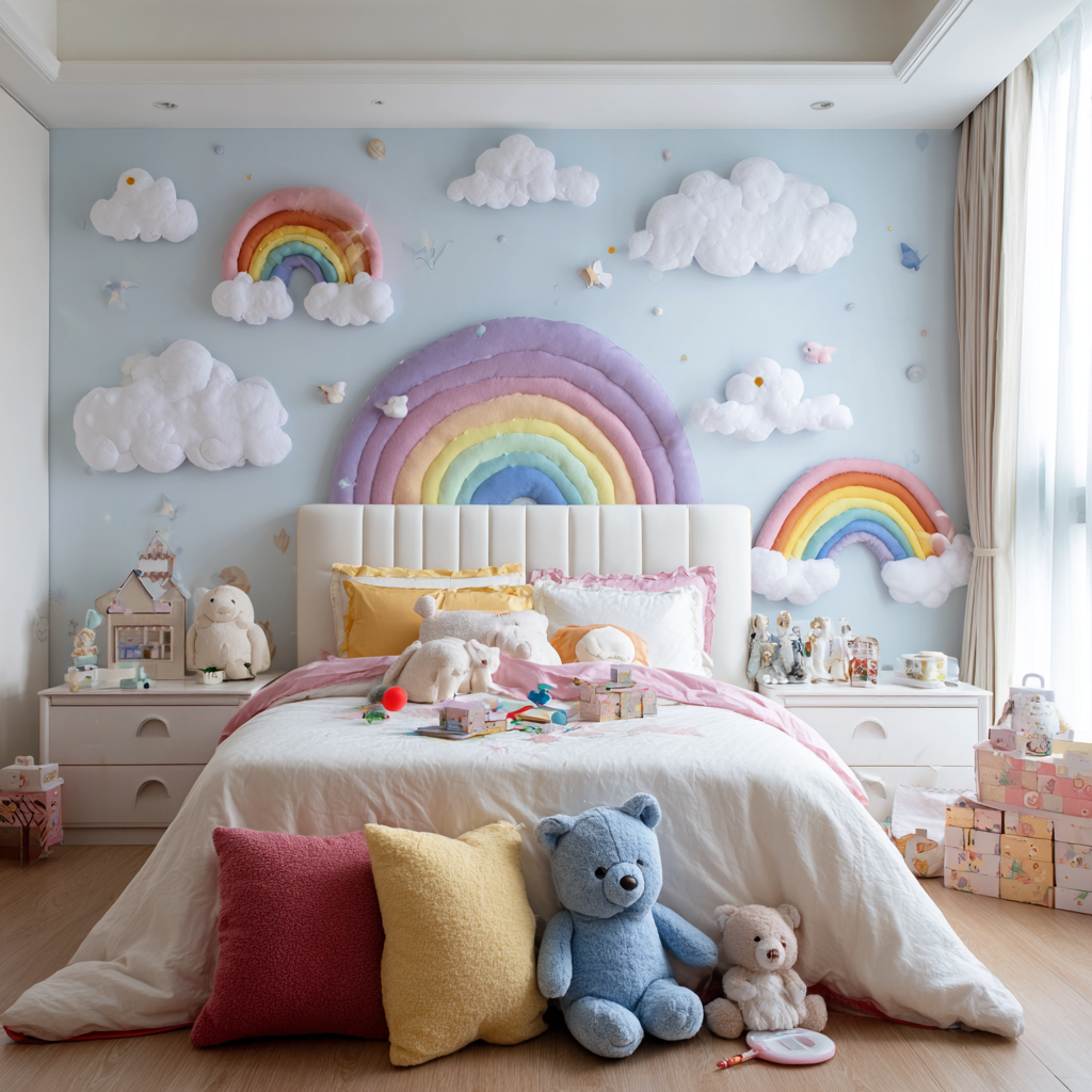
Purple: Magic and Big Imagination

Purple fuels creativity, pretend play, and imagination. Dark purples can feel a bit heavy, so lean into lavender or pastel purples that feel dreamy and light. It gives a creative spark without the emotional drama.
Pink: Soft, Sweet Comfort
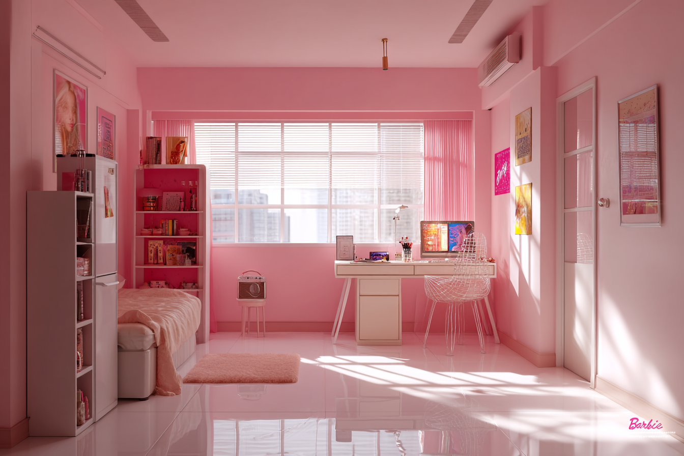
Pink brings comfort and emotional warmth. It can soften aggression and make spaces feel safer. Warm pinks feel nurturing. Neon pinks? Fun for accessories, not always for full walls.
Interiors on your mind?
Warm vs. Cool: The Real Behaviour Switch

Warm colours (red, orange, yellow, warm pinks, softer warm purples) → energising, expressive, social, stimulating.
Cool colours (green, blue, lavender, soft sky pinks, pastel purple-blue mixes) → calming, focusing, emotionally regulating, grounding.
Most kids thrive in spaces that mix both thoughtfully. A room that is all warm may feel chaotic. A room that is all cool may feel flat or sleepy. Balance is the secret ingredient.
Where to Use What

Study areas: Green or soft blue for focus that sticks.
Bedrooms: Soft green, sky blue, or lavender for calmer nights.
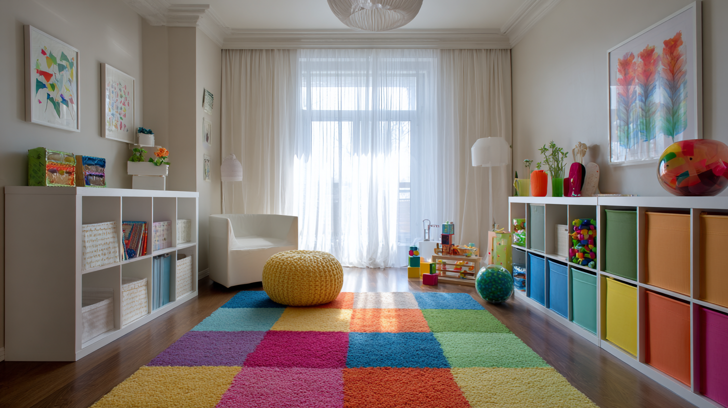
Playrooms: Warm yellow or soft orange for instant joy, with red or purple accents for creative spark.
Shared rooms: Start with a neutral base like cream or beige, then layer warm or cool based on the room’s purpose.
The Takeaway
Colour is not just paint for kids. It’s atmosphere. Pick it with intent, and the room works like a silent mood assistant.
Want more ideas that make your home feel cosier and kinder to daily routines? HomeBliss is always ready with simple decor inspiration that actually works in real rooms!