
Last updated on November 13th, 2025
Paint has the power to transform your home — but it can also age it faster than you realise. Some shades that once felt bold or timeless now make spaces look tired or overly themed. The key to keeping your home fresh in 2026? Knowing which colours to retire and what to replace them with.
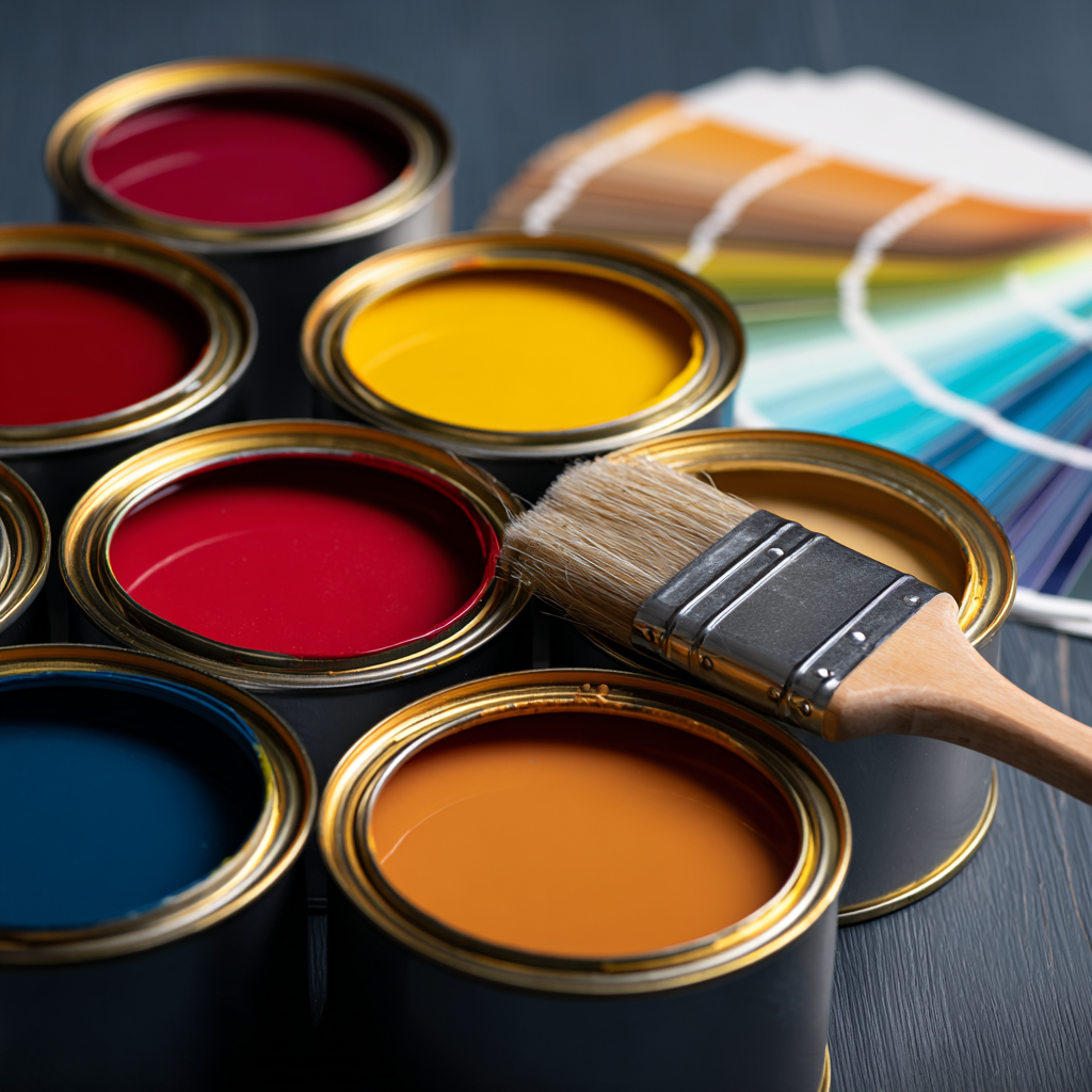
Here’s a quick guide to the paint shades that might be quietly dating your space — and the modern hues designers are loving instead.
Looking to get your interiors done?
Poster Red — Too Loud, Too Fast
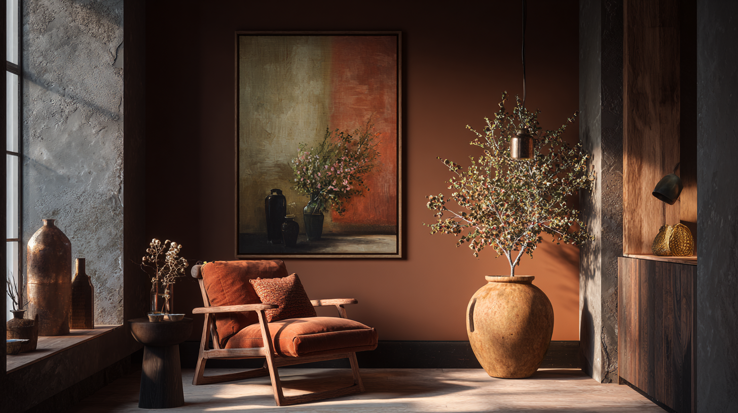
There was a time when bright red walls meant drama, energy, and confidence. But today, poster red feels more overwhelming than exciting. It tends to dominate a room, making it hard for furniture, art, or lighting to stand out.
Swap it for: Rust, muted terracotta, or deep clay tones. They bring the same warmth and energy but feel softer, earthier, and far more livable.
Interiors in need of an upgrade?
Yellow-Beige — The “Builder Default” Tone
This once-popular creamy yellow-beige was everywhere in the 2000s — hallways, rentals, and even bedrooms. While it seemed neutral then, it now casts a dated yellow tint that flattens light and makes spaces feel tired.
Swap it for: Greige, warm ivory, or mushroom beige. These new-age neutrals work with any décor style and give a cleaner, sunlit feel without the heavy yellow undertone.
Stark White — Too Cold, Too Clinical
White walls will always be classic — but stark white, with its icy blue undertones, can make a home feel harsh and uninviting. It works in galleries, not in cosy homes.
Swap it for: Soft whites with cream or linen undertones. They still keep things bright but add warmth and texture. Bonus tip: matte finishes feel modern, while glossy whites tend to highlight every imperfection.
Black Walls — Bold but Heavy
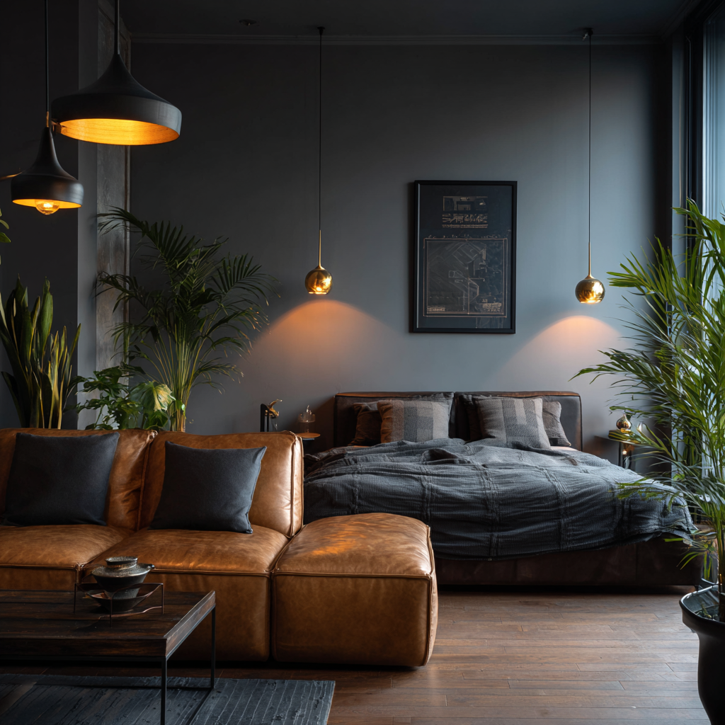
A few years ago, matte black walls were the height of sophistication. But in smaller homes, they can absorb light, shrink space, and make rooms feel closed in. Designers now prefer balance over intensity.
Swap it for: Charcoal grey, deep navy, or moody olive. These shades bring the same dramatic edge but reflect light better and feel softer on the eyes.
Forest Green — Once Trendy, Now Tired

Deep forest green had its moment in the late 2010s — lush, moody, and perfect for statement walls. But after years of dominance, it’s starting to feel predictable. In darker homes, it can make rooms look heavy instead of serene.
Swap it for: Sage, eucalyptus, or dusty olive. These lighter greens bring the same natural calm but with an airy, modern touch. They pair beautifully with neutrals, wood, and brass accents.
Need to refresh your interiors?
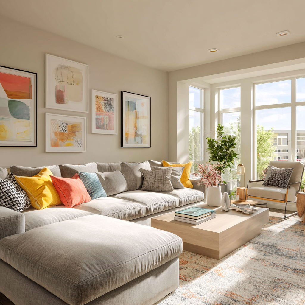
Too Many Contrasts at Once
Even the best colours can age a space when used in extremes. High-contrast pairings — like black-and-white stripes or red-and-grey combos — feel too graphic for 2026’s softer, more fluid style.
Try instead: Layered neutrals and tone-on-tone palettes. Think soft contrasts — beige with clay, cream with greige, or sage with ivory. The effect feels warm, calm, and effortlessly elevated.
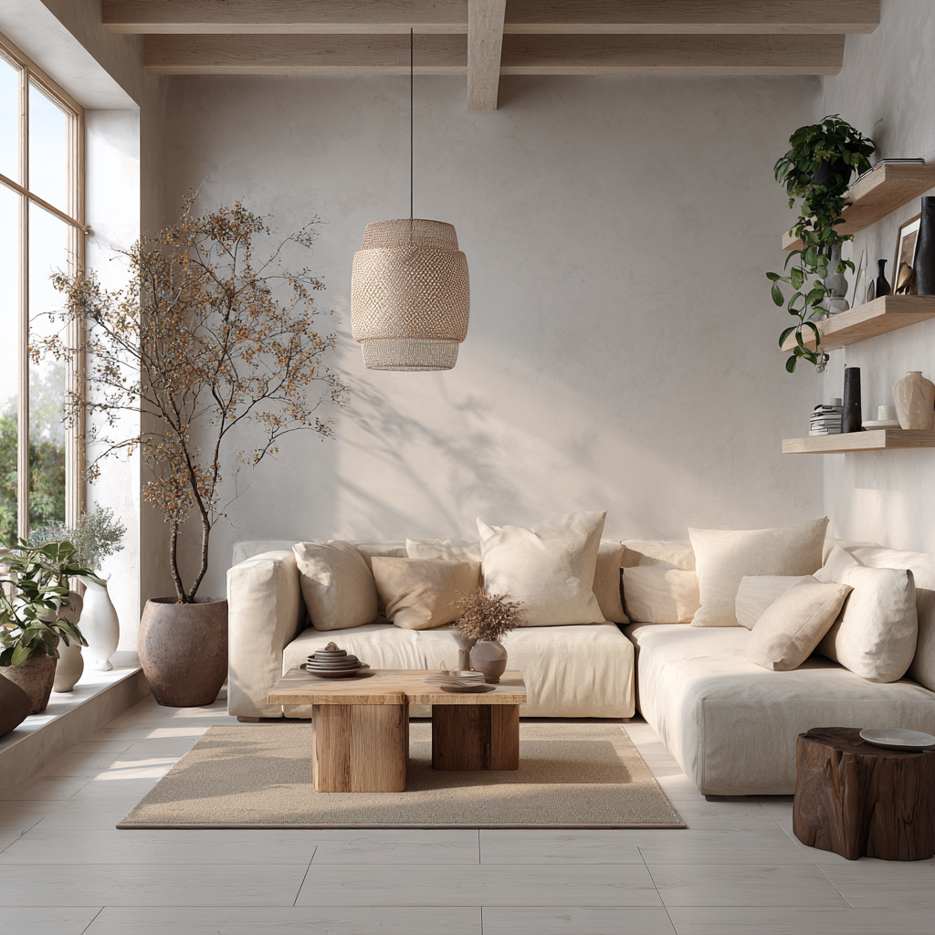
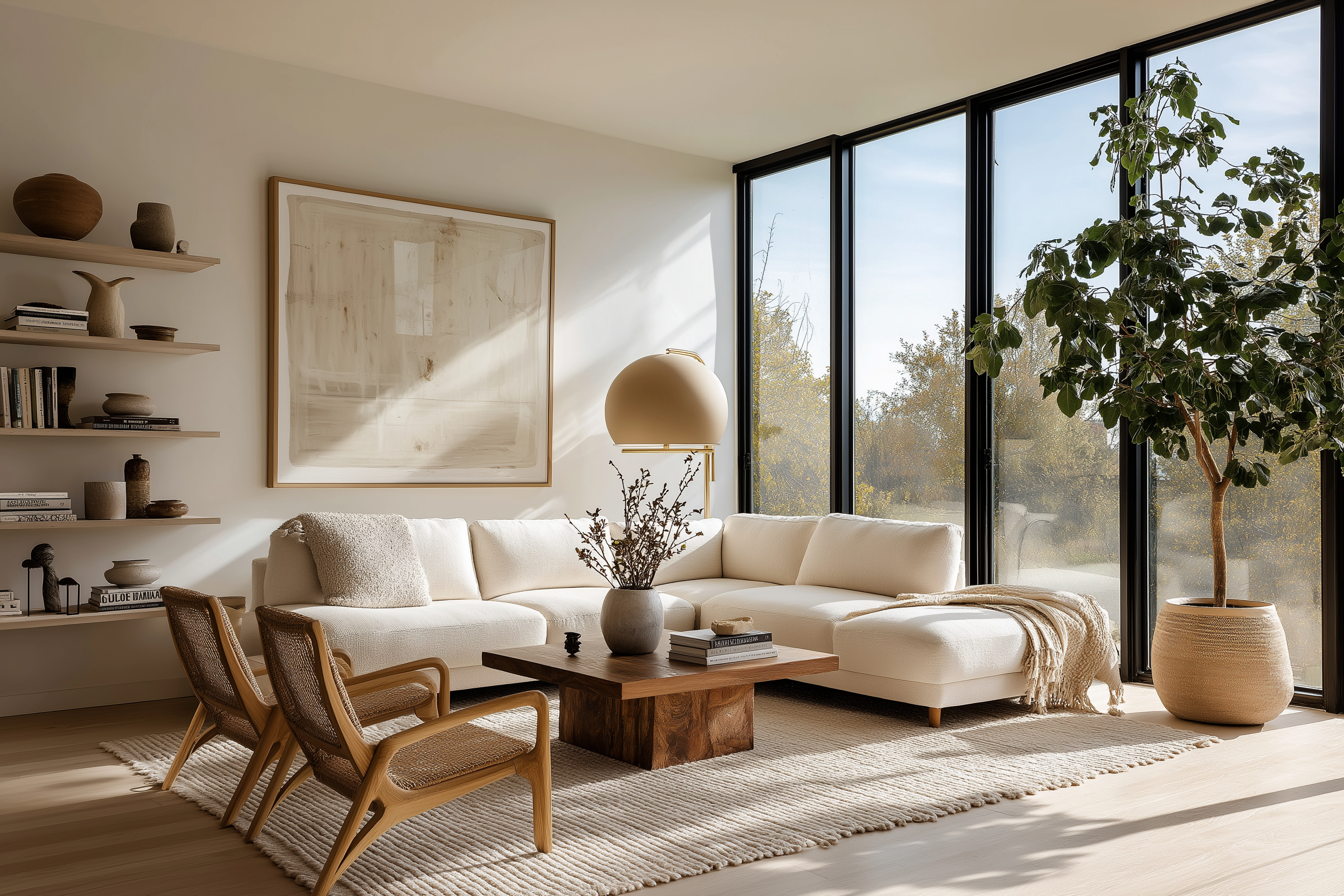
Quiet Luxury in Colour

The right paint shade doesn’t scream — it whispers. Today’s most timeless interiors use color to create balance, not shock value. Warm undertones, diffused light, and earthy hues are replacing high-contrast, high-drama colours.
If your walls still reflect a decade-old trend, it might be time for a refresh. Choose shades that calm the eye, enhance natural light, and bring quiet joy every time you walk in. Because in 2026, the most stylish homes don’t shout “look at me” — they simply feel good.
And that, as always, is HomeBliss.