
Last updated on June 24th, 2025
Curtains are much more than just window coverings; they are a powerful design element that can dramatically alter the look and feel of any room. But selecting the right curtain color combination is key to achieving that dream home aesthetic.
Let’s find out how thoughtful curtain choices can elevate a space from ordinary to extraordinary.
Looking to get your interiors done?
The Power of Two: Layering Colors for Depth
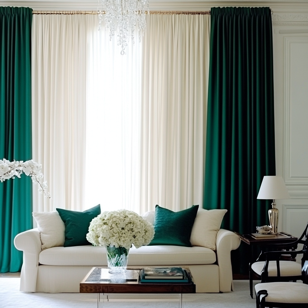
One of the most effective ways to use curtains to transform a room is by embracing layered color combinations. This technique adds depth, texture, and visual interest that a single curtain simply cannot achieve. Think about pairing a sheer, light-colored curtain underneath a heavier, bolder one. This allows for flexibility in light control and creates a sophisticated layered effect. For instance, a soft cream sheer combined with a rich emerald green opaque curtain can bring a sense of luxury and calm to a living room, especially when balanced with neutral furniture.
Interiors in need of an upgrade?
Harmonious Hues: Complementary Combinations
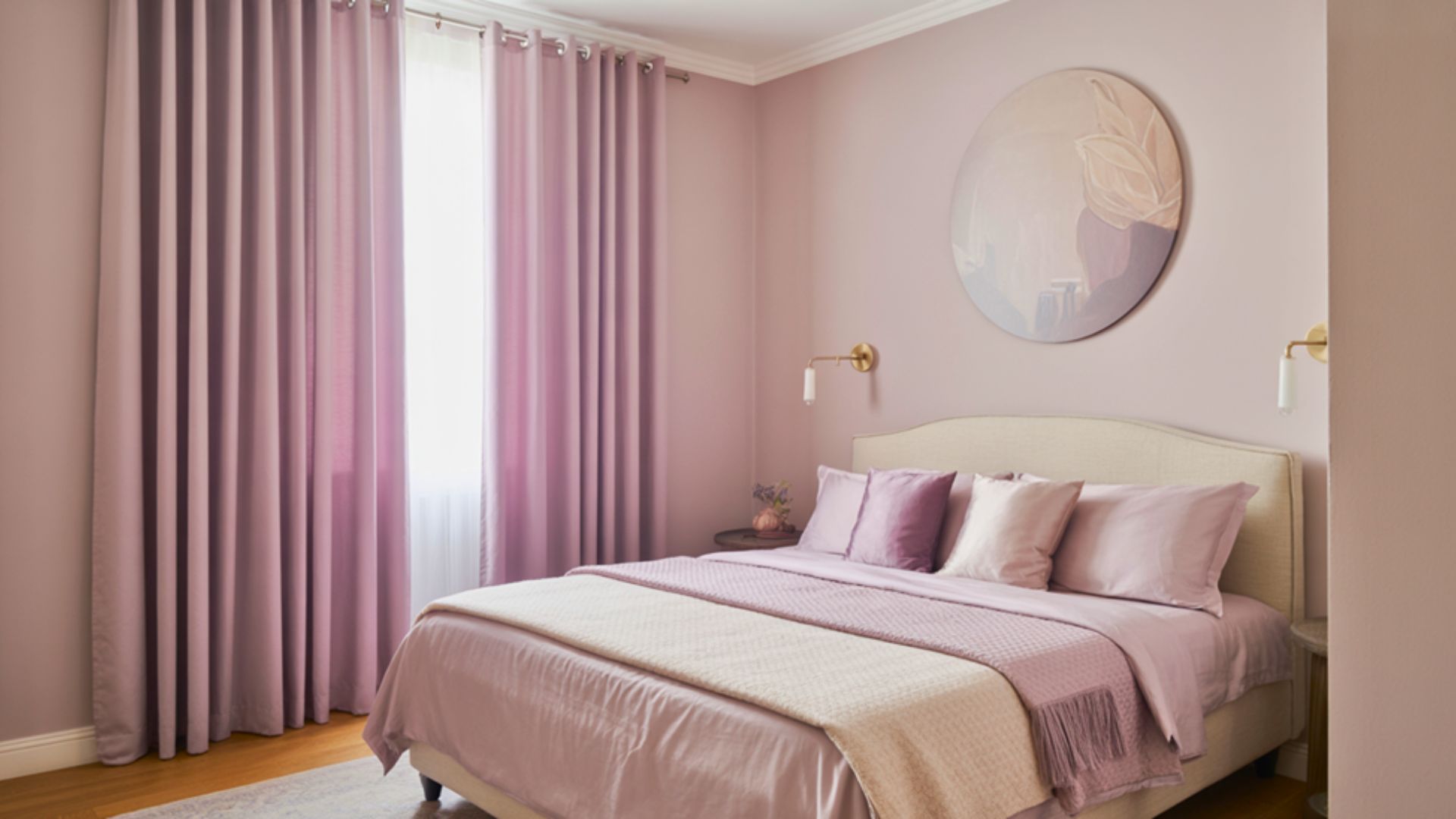
Choosing complementary colors for your curtains can create a beautifully harmonious space. Complementary colors are opposite each other on the color wheel and provide a vibrant contrast when used together. Imagine a living room with walls in a subtle beige tone. Introducing curtains that combine a muted teal with a warm coral can instantly infuse energy and personality into the room without overwhelming it. This approach works particularly well in bedrooms where a calming yet visually engaging atmosphere is desired. For example, a soft lavender paired with a pale grey can create a serene and elegant retreat.
Beyond the Walls: Matching Curtains to Furniture

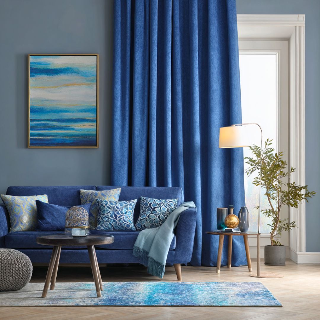
While it’s tempting to pick curtains that perfectly match your wall color, a more impactful approach is to consider your existing furniture and decor. Curtains can act as a bridge between different elements in a room, tying everything together. If your sofa is a deep navy blue, consider curtains that incorporate shades of blue, perhaps with a subtle pattern or a complementary secondary color like soft gold. This creates a cohesive look and makes the room feel intentionally designed rather than haphazardly assembled. This strategy is particularly effective in smaller rooms where every element needs to contribute to a unified aesthetic.
Need to refresh your interiors?
Bold Statements: Contrasting Colors for Impact

For those who are not afraid to make a statement, contrasting curtain colors can create a truly memorable interior. This involves selecting colors that are distinctly different but still work well together to create a focal point. For instance, in a contemporary dining room with minimalist furniture, a combination of charcoal grey and a vibrant mustard yellow in your curtains can add a punch of personality and modernity. The key here is balance; ensure that the bold curtain choice is supported by other elements in the room, perhaps through accent pillows or artwork, to avoid a disconnected feel.
For more tips on creating a harmonious home, don’t forget to check out the rest of our blog posts on Homebliss. Your journey to a more balanced and positive living space starts here!


