Last updated on October 22nd, 2025
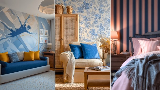
Mixing wallpaper, prints, and colors might sound intimidating — but when done right, it’s pure magic. The secret lies in balance. With a few smart design choices, you can blend patterns and hues that complement each other without clashing.
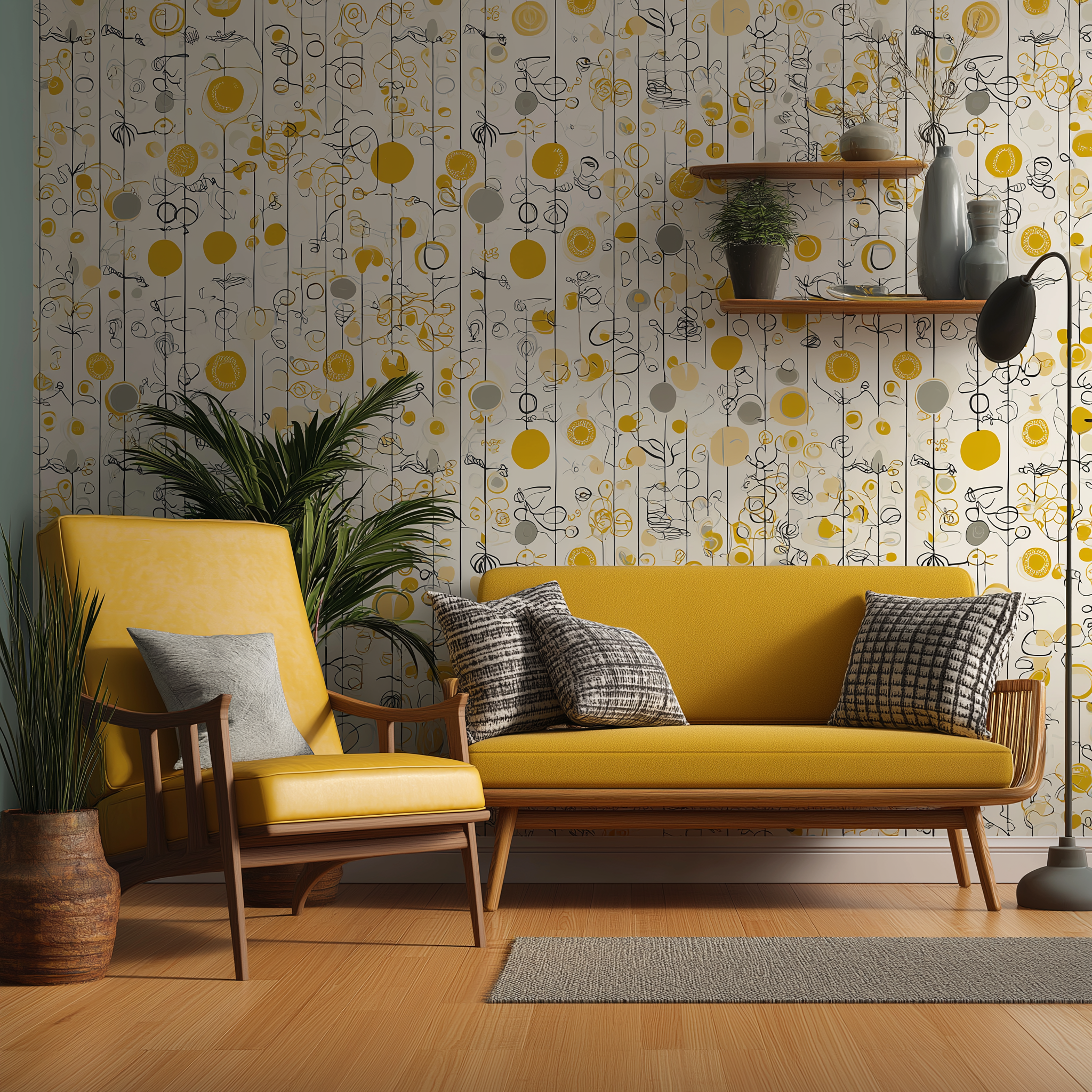
Whether you love bold florals or subtle textures, this simple guide will help you mix and match with confidence and flair.
Looking to get your interiors done?
1. Start With a Hero Element
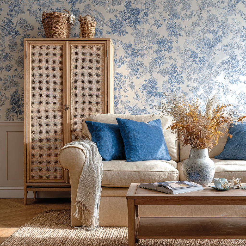
Every great design needs a starting point — your hero. It could be a stunning wallpaper, a statement rug, or even a colorful piece of art. Let that element guide your palette. Pick two or three shades from it, and repeat them throughout the room in smaller accents like cushions, curtains, or decor. This ties everything together effortlessly.
Interiors in need of an upgrade?
2. Choose a Coordinated Color Scheme
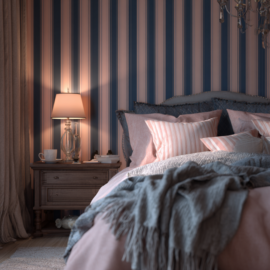
When mixing prints and wallpaper, color harmony is key. Stick to one main color family — say blues, greens, or neutrals — and add one or two complementary shades. Warm and cool tones can coexist beautifully if you maintain a common undertone. If your wallpaper is busy, keep furniture and fabrics in solid, calming hues.
3. Mix Prints of Different Scales
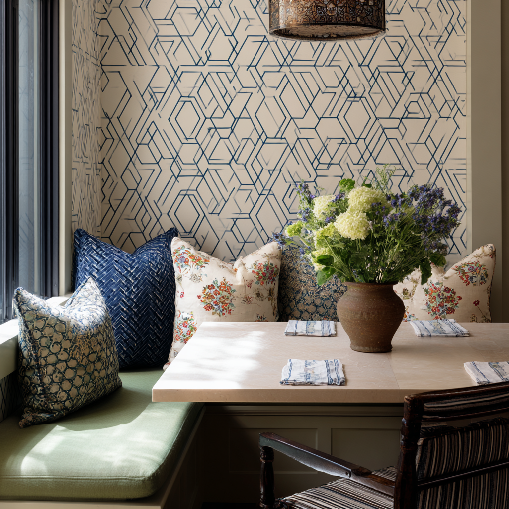
Too many big patterns can overwhelm a space, while too many tiny ones can make it feel fussy. The trick? Mix scales. If your wallpaper has large motifs, pair it with smaller prints on cushions or throws. This creates rhythm and balance — your eyes move smoothly across the room instead of getting stuck in one spot.
4. Add Texture for Depth
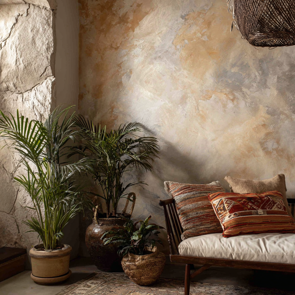
Don’t forget the power of texture! Woven fabrics, wooden accents, or metallic finishes add richness and keep the space from looking flat. Matte wallpapers pair beautifully with glossy tiles or glass decor. Even subtle touches — like a jute rug or a velvet throw — can make mixed patterns feel more grounded.
5. Create a Calm Base With Neutrals

Neutrals are your best friend when you’re mixing multiple prints. Use white, beige, gray, or tan as the base, and layer your colors on top. Neutral walls or furniture act like a pause between bolder elements, helping the design breathe. Think of it as the quiet space between musical notes — essential for harmony.
6. Use Wallpaper Sparingly in Small Rooms
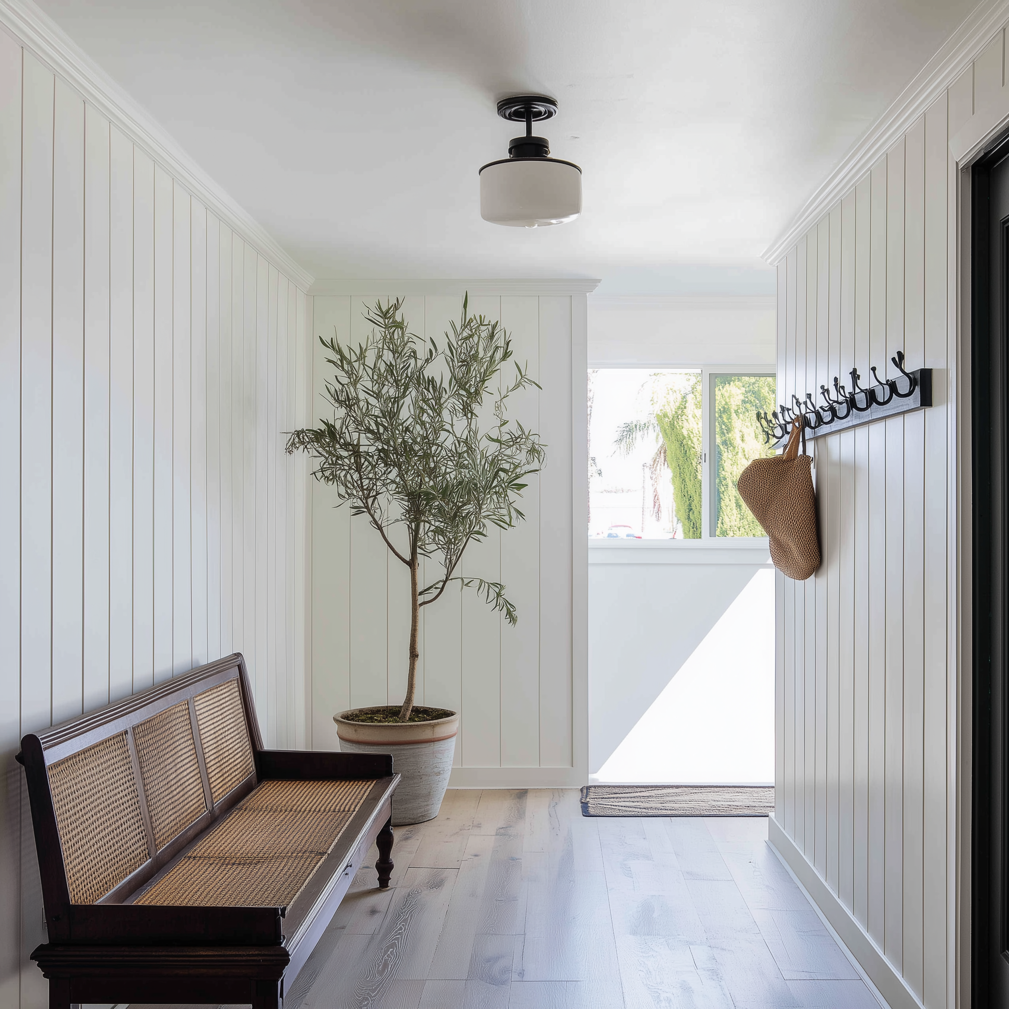
In compact spaces, less is more. Use wallpaper on one accent wall or just above wainscoting to keep things airy. Choose smaller, lighter prints that don’t overwhelm the eye—pinstripes that are far apart are a lovely idea. You can also opt for textured wallpapers like grasscloth or linen weave for subtle elegance without the visual clutter.
Need to refresh your interiors?
7. Tie It All Together With Repetition
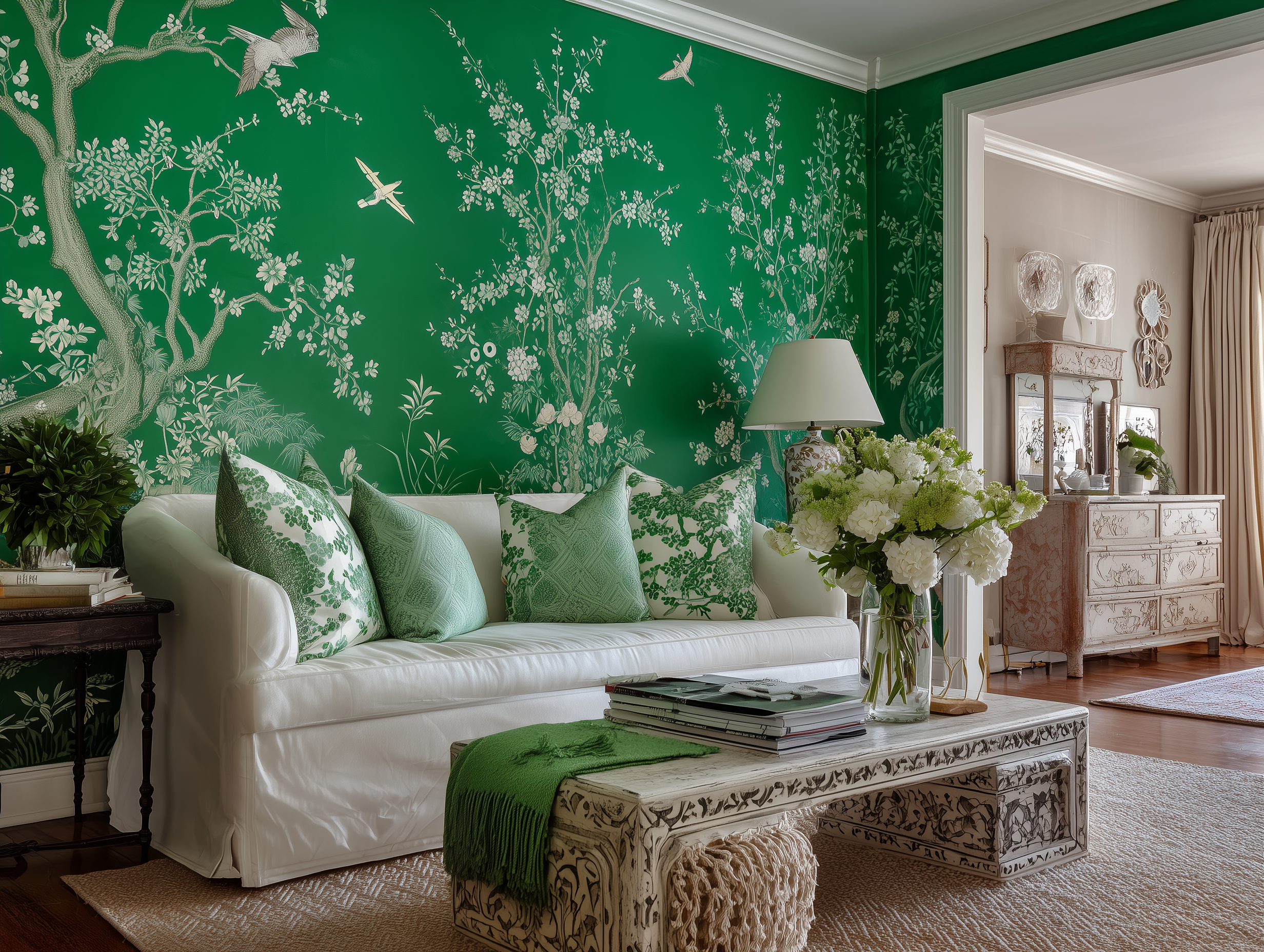
The easiest way to make different elements feel cohesive is to repeat colors or shapes. If your wallpaper has circular motifs, echo them in mirrors or side tables. If it’s floral, repeat a similar print in smaller details like throw pillows or artwork. Repetition makes your decor look intentional — not accidental.
Patterns That Play in Harmony
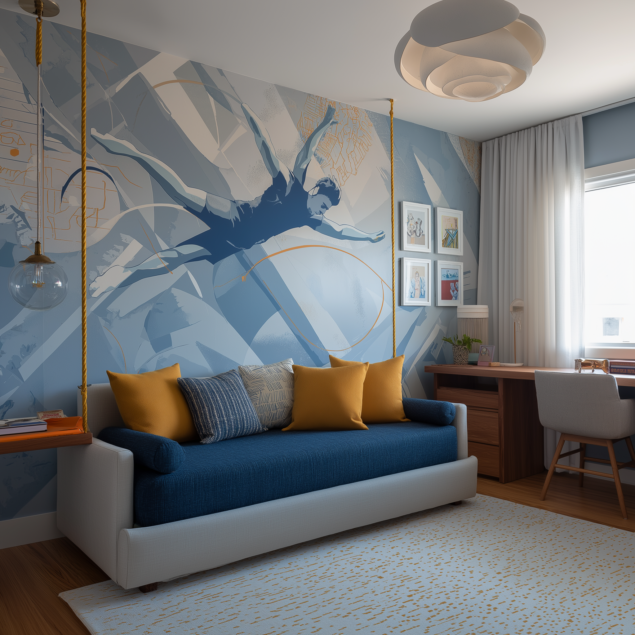
Wallpaper, prints, and colors don’t have to compete — they can complement each other beautifully when balanced with care. Start with one bold element, add texture and neutrals, and repeat hues subtly across the space. Soon, you’ll have a room that feels layered, personal, and perfectly put together. And for more easy design inspiration that helps your home sing in color and style, stay tuned to HomeBliss.


