Last updated on October 5th, 2026
Ever walked into a living room and instantly felt comfortable, even though you couldn’t quite explain why? Color can have a lot to do with it.

In Vastu-inspired interiors, colors are often chosen for the qualities they are traditionally believed to represent, from calm and harmony to warmth and positivity. And the good news is that many of these shades also happen to be wonderfully easy to decorate with.
Here are five to consider for your living room.
1. Blue: Keep Things Calm
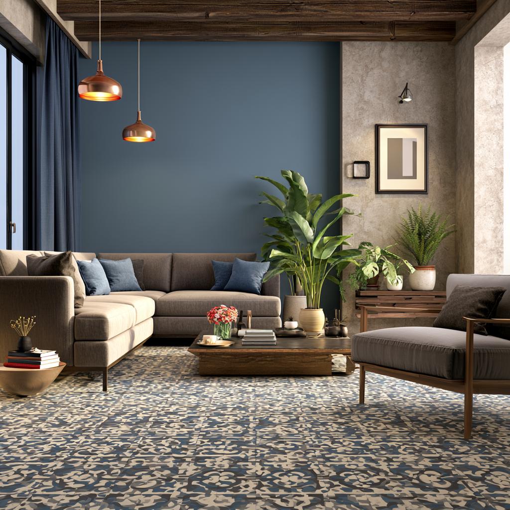
Bring down the volume, beautifully!
Blue is traditionally associated with calmness and tranquility, making it an appealing choice for a living room that’s meant to help you slow down and relax.
You don’t necessarily need blue walls. Try a soft blue sofa, patterned rug, cushions, curtains, or artwork against a neutral backdrop. Muted blues tend to feel restful, while deeper navy and blue-gray shades can make the room look sophisticated and grounded.
Looking to get your interiors done?
2. Green: Bring Nature Indoors

A little green goes a long way!
Green is associated with nature, growth, harmony, and freshness, so it feels right at home in a space where family and friends gather.
Sage and muted olive work beautifully across larger surfaces, while richer greens can make striking accent colors. And yes, your indoor plants count toward the overall effect too. Pair green with wood, cane, cream, or warm white for a living room that feels relaxed rather than overly themed.
3. Yellow: Turn Up The Cheer

Instant sunshine, no weather forecast required!
In Vastu traditions, yellow is commonly connected with optimism, warmth, and positive energy. It’s also one of the easiest ways to perk up a living room that feels a little flat.
The trick is choosing the right yellow. Instead of covering every wall in an intense lemon shade, explore softer butter, ochre, mustard, or muted golden tones. A yellow armchair, cushions, artwork, or a single accent wall can be plenty.
Looking to get your interiors done?
4. Beige: Create A Peaceful Backdrop

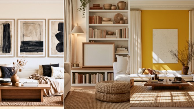
Quiet color, surprisingly big impact!
Beige may not shout for attention, but that’s precisely its charm. Its warm, earthy quality can create a sense of stability and ease while giving the rest of your living room plenty of room to shine.
Layer different shades rather than using one beige everywhere. Cream walls, a sand-colored sofa, natural-fiber rug, and warm wood can create depth without disturbing the calm.
5. Tan: Warm Things Up

Neutral doesn’t have to mean chilly!
Tan brings an earthy warmth to the living room and works particularly well if you love natural materials and understated interiors.
Introduce it through leather or leather-look seating, wood furniture, rugs, curtains, or upholstery. Pair tan with cream for softness, green for a nature-inspired palette, or blue for an elegant contrast.
Looking to get your interiors done?
The Real Feel-Good Color Trick

Vastu can provide inspiration for choosing colors, but your living room still needs to feel like your home. Consider the room’s natural light, existing furniture, size, and, most importantly, the colors that make you feel comfortable.
Blue, green, yellow, beige, and tan offer an easy starting palette for creating a living room that feels warm, balanced, and welcoming.
At HomeBliss, we love color ideas that make a home feel as good as it looks. Keep exploring the HomeBliss blog for inspiring palettes, clever decorating ideas, and simple ways to give your favorite spaces a fresh new mood.


