
Last updated on January 16th, 2026
The colours you choose at home do more than decorate; they shape how you feel, think, and move through your day with subtle power.
1. Yellow: Happy Energy With A Spark

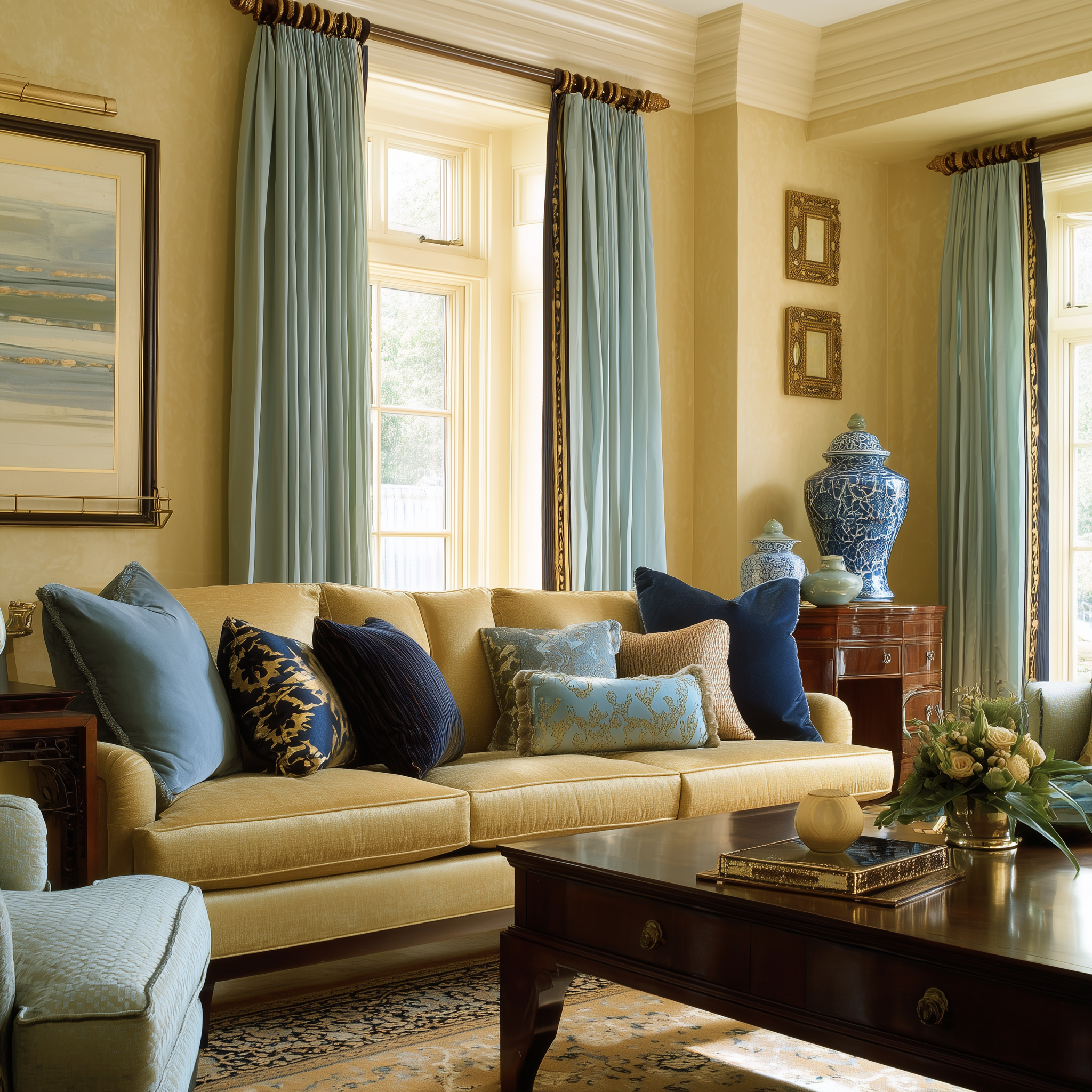
Yellow is sunshine in paint form. It instantly lifts the feeling in a room, triggers warmth, and promotes optimism. It’s a great choice for kitchens and dining areas where laughter and energy matter.
Be mindful with bright yellow in spaces where calm or focus is needed, like bedrooms or study corners — too much can feel too “busy” mentally. A softer buttery yellow feels welcoming without turning your brain up to high alert.
Looking to get your interiors done?
2. Green: Balanced Calm That Supports Focus

Green is the go-to color for balance. Close to nature, it helps calm nerves and improve concentration. This makes it ideal for home offices, reading nooks, or bedrooms where a sense of peace is more important than excitement.
Soft sage, muted emerald, or gentle mint tones all help the eyes rest and the brain reset. Green doesn’t shout — it listens.
3. Pink: Warm, Gentle, And Soothing

Pink isn’t just for kids’ rooms. Soft pinks wrap a room in warmth, gentleness, and emotional comfort. They work especially well in spaces where you want to destress and feel held, like bedrooms or quiet corners.
Deep or neon pinks can be energizing, but they’re less calming. Stick to pale, warm pinks if peace and softness are the mood you’re after.
Looking to get your interiors done?
4. Blue: Cool Calm And Clear Thinking
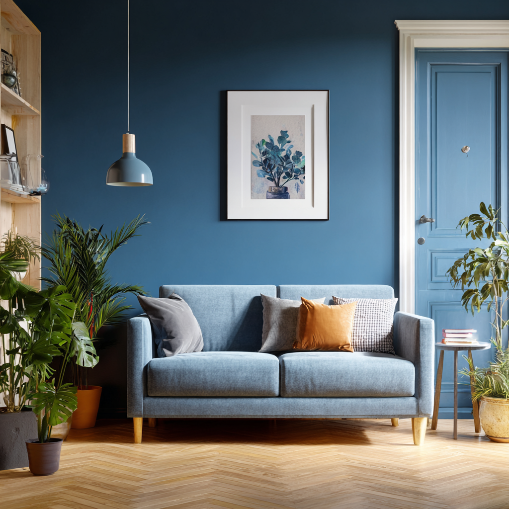
Blue signals calm and clarity. It can slow the heart rate and settle the mind, which is perfect for bedrooms and bathrooms. In workspaces, muted blues support focus without feeling too serious or sterile.
Icy blues? Use them sparingly. Softer blues feel emotionally kinder.
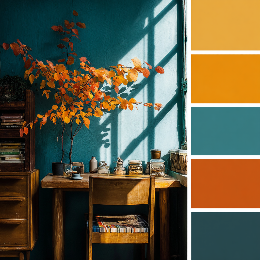
5. Orange: Social, Uplifting, Not Overwhelming

Orange radiates warmth and social energy. It’s inviting, fun, and great for spaces where activity and conversation happen — think dining rooms or creative corners.
Too much bright orange can feel like emotional “volume up.” A softer terracotta or warm peach shade brings cheer without hyperdrive.
6. Purple: Creative Calm And Reflective Energy

Purple lives between warm and cool. Lighter lavenders and muted plums feel soothing and dreamy — perfect for creative spaces or meditation areas.
Deeper purples carry mystery and depth, but they can lean heavy if overused. Consider accent walls or small doses if you want the energy without the intensity.
Looking to get your interiors done?
7. Red: Bold Energy That Packs A Punch
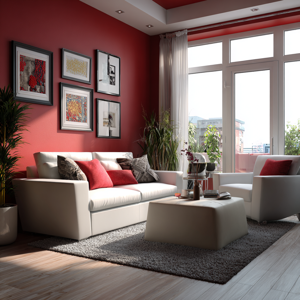 Red triggers energy, appetite, and warmth. It’s dramatic and magnetic, making it a fun choice for dining rooms or entryways where you want immediate impact.
Caution: too much red in bedrooms or study areas can signal high energy when you want calm or focus instead. If you love red, use it as an accent — a bold pillow, a small wall area, or a piece of art.
8. Combinations That Balance Mood And Focus
Single colors carry strong signals. Combinations help balance them:
-Yellow + green: uplifting yet steady — great for kitchens or workspaces where mood and calm both matter.
-Blue + soft gray: calm and focused — ideal for offices or bedrooms.
-Pink + cream: gentle and warm — perfect for living rooms or relaxation corners.
-Green + blue: nature-inspired calm with intelligent focus — strong for study or reading rooms.
Balanced palettes mean one color sets the emotional tone, while the other gives it structure.
9. Where to Use What, Quickly

Living rooms: warm neutrals + soft accents to boost conversation and comfort
Bedrooms: cool calm tones like soft blue or muted green for rest
Home offices: balanced hues like green or blue for focus, plus mild warmth to keep energy steady
Dining areas: cheerful yellows or warmer combinations to invite social connection
Hallways/entry: bold pops (like red accents) to make a confident first impression
Interiors on your mind?
The Takeaway

Colour isn’t decoration. It’s emotional architecture. The shades you live with shape your inner state every day. Bright tones can lift energy. Cool tones can calm and focus. Mixed palettes can blend peace with purpose.
At HomeBliss, we believe your home’s colours should help you feel good, think clearly, and live intentionally. Thoughtful colour choices make rooms not only look better but feel better — and that’s the quiet magic of well-chosen paint.