Last updated on December 15th, 2023
Trends are fickle bedmates. What worked in the past will seem dated a few years down the line. You can hold on to what you have, or try something new. We like change, and we are sure you do too. If interior design pandits are to be believed, you may need to give your guest room colors a second glance in 2024.

So, what do designers advise for this space to keep in tune with the latest guest room color style? Let’s look at the running trend and find out how to give it a tweak to make the space inviting.
1. Grey is good but dark brown is better
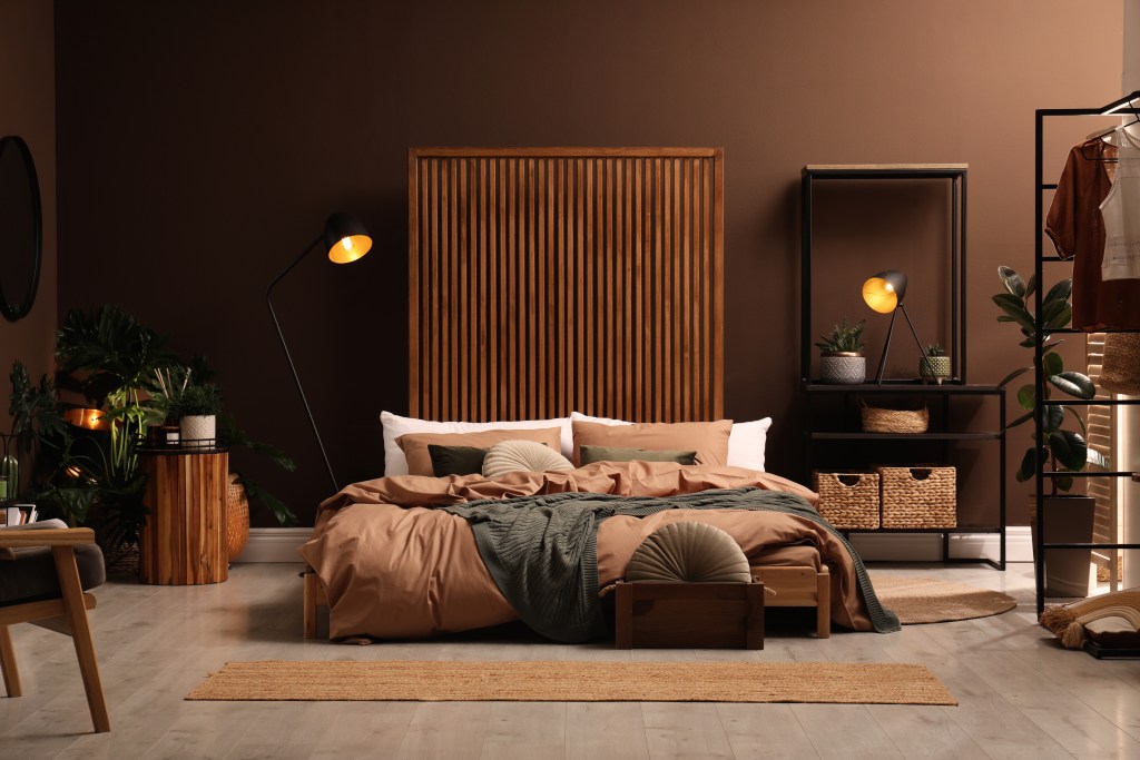
A deep chocolate brown color oozes style and confidence. What makes it irresistible is that it goes beautifully with pastels and bright colors. This color anchors the look as it is very grounded. It does great when used alone in different tonal values and with complementary shades as well. Brown doesn’t believe in mincing matters. In its dark avatar, it takes your guest room decor to the next level.
2. Blue is soothing, but green is out-of-this-world
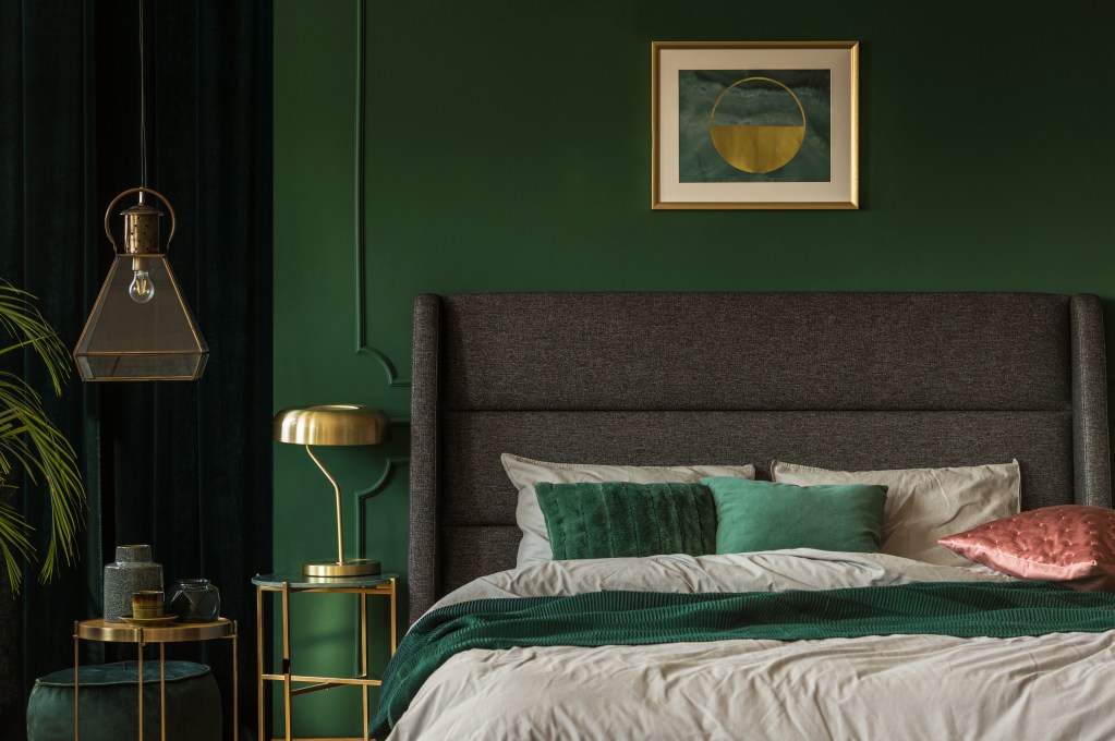
Green is a class act if there ever was one. And, it’s time for your blue shade to move over and make room for this gorgeous shade. Green is the color of Mother Nature and will endure till time immemorial. The green family, be it olive, mint, or moss plays a dual role. It can energize and it can calm when the need arises. For a peaceful setting, green is your best bet. Layer this look with floral motifs, wallpaper, and lots of plants.
3. Barbie pink was the hot favorite, but it’s time to let salmon pink rule
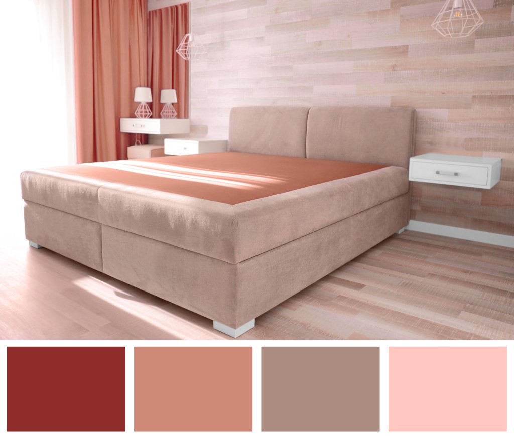
It’s time to tone down the bright Barbie pink shade and give your walls the gentle touch of salmon pink. Pink has always been a popular shade in interior design. Shades such as salmon pink and peach have an edge because of their rich and warm orange undertone. Salmon has a friendly and approachable vibe, something that is needed for a guest room.
4. Neutrals are the favorites. It’s time to add some warmth

Neutrals are not easy to define. These shades dance between various shades of beiges and greys. Light plays a vital role in how the neutral shades will play out. The warm neutrals are shades that have a hint of yellow or green in them. Greyish green is one example. Cool neutrals on the other hand have a smidgen of violet or pink in them. Once you have picked out your shade, amp up the look with texture in your rug or wall art. While the walls are mute spectators, it’s the texture and earthy tones on the bed linen and rug that do all the talking.
5. Deep violets and indigo? Switch to soft lilac

Indigo and violet are the colors of royalty. Now it’s time to replace these dominant shades with the softer lilac. The gorgeous lilac shades are like a breath of fresh air after the assault of deep purples on the senses. While these are great shades too, it’s time to look at new beginnings. Soft lilac has feminine overtones, but hey, with men exploring their feminine side with pink in their wardrobe, lilac shouldn’t be a problem.
Our thoughts

Over time, wall paints look dull and lifeless. A fresh coat of paint is just the thing to spruce up your decor. This is the perfect excuse when your fingers are itching for a reason to dramatically change your decor. This change will inspire you to address other areas of your home too. And everything need not cost a bundle. Check out our blogs on low-budget decors and makeovers to have your cake and eat it too! Remember, no one says it better than homebliss.in!


